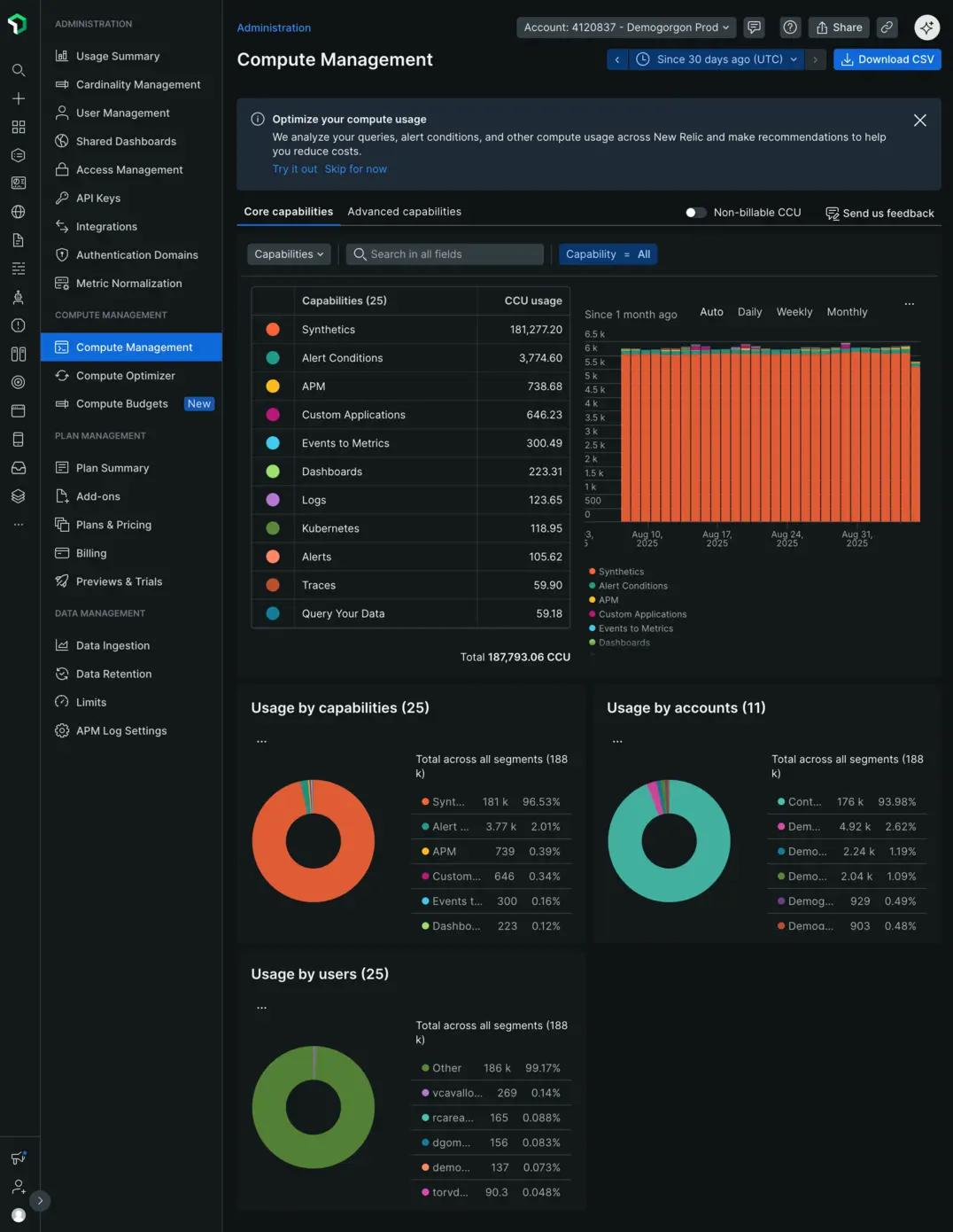
As a New Relic Admin, the
ヒント
Access Compute Management
To open the

Break down your usage
The
Within each tab, use the dynamic chart controls to focus on specific entities: select a category (Accounts, Users, or Capabilities) from the dropdown, search for specific entities, or apply filters to narrow your view.
ヒント
While you can group the dynamic chart data by daily, weekly, or monthly intervals, when adding it to a dashboard, select
To understand your overall consumption, the donut charts give a comprehensive view of the number and percentage of CCUs contributed by capabilities, users, and accounts over one month. These charts are unaffected by any filters you apply.
Switch between billable and non-billable CCU views
The page shows either billable or non-billable CCU information. By default, you'll see billable CCU data. To switch to non-billable CCU data, toggle on the
Manage and share your usage data
From the menu of each of the charts, you can:
- Add it to one of your dashboards for easy monitoring.
- Set up an alert to notify you of significant changes in usage.
- Share a real-time view of your data with stakeholders.
- Save the chart as an image for presentations or reports.
- Get the underlying query that powers the chart, which you can use for your own custom reports or deeper analysis.